Goodpoints


Goodpoints is a community based news application from a company that I co-founded. It features a front page, topics page and organizations page which are all ordered based on the amount of interaction users have with the content. The desire was to game-ify news content to create highly engaged communities around specifics topics. Below are some high levels product goals.
Product goals
- Create an engaged community.
- Let the community dictate what content is important.
- Transparently reward and track engagement.
- Use knowledge from gaming to add fun, competition, player journey.
Goodpoints is the first step in creating a template that we could use for other topics, company's, IP, etc. It's a product we hope to expand and grow to help facilitate social impact.
I created the UX, visual design and branding in collaboration with the other two founders. The idea is that we could publish apps every week under a new topic using the framework that we have created. In the future we will be iterating on the product based on the data we're collecting and hopefully some user interviews.
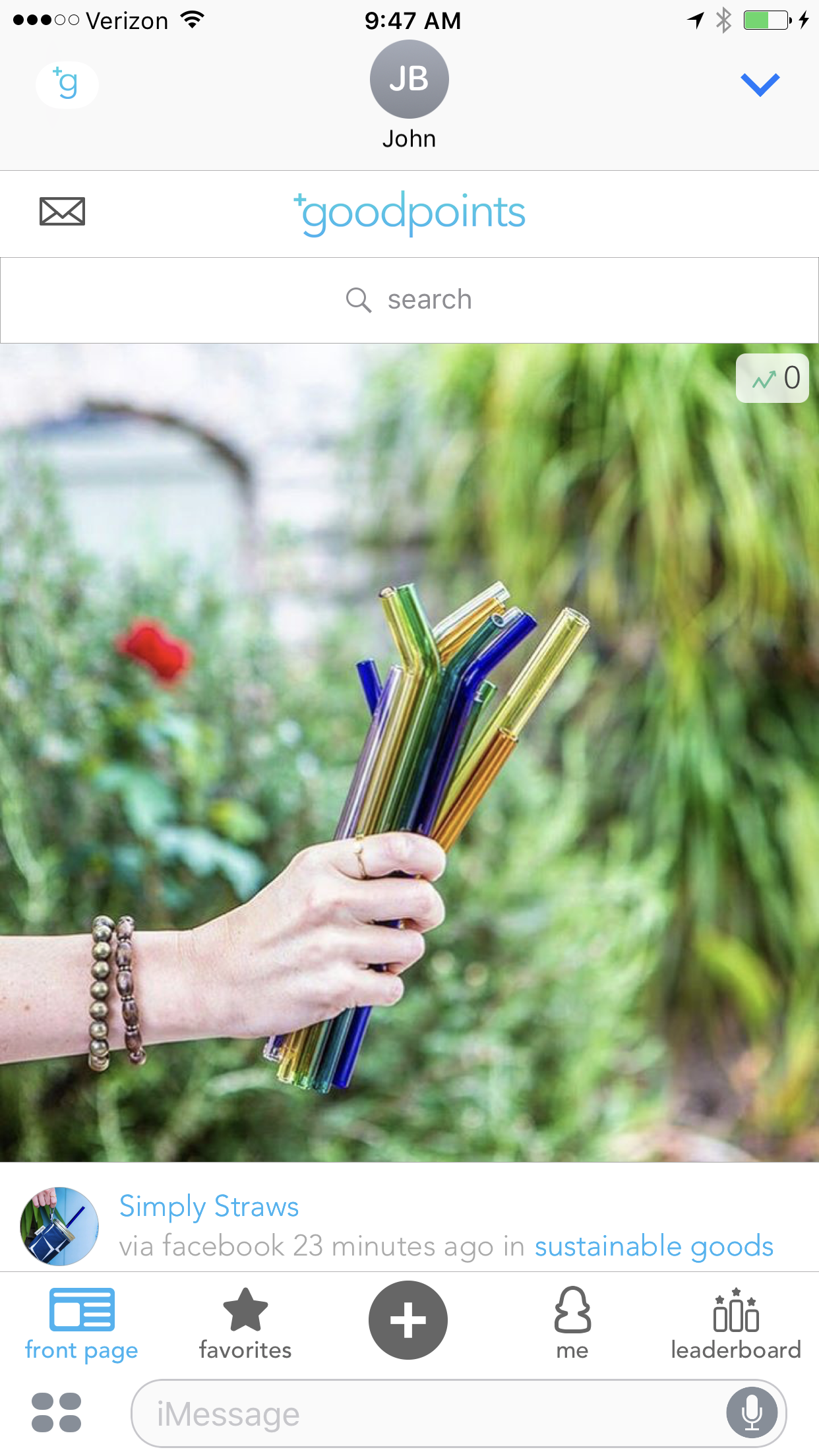
The Front Page
A screenshot of for the Front Page screen
The Front Page features an “up-voting system” that surfaces content that the community cares about. We clearly indicate the amount of +1's a post has so users understands why certain posts are at the top of the list. We focused on the ”+” animation to catch the user's eye and clearly indicate the value of certain interactions. In visual design we were influenced by Instagram's recent redesign and kept the visuals and UX simple. The content should be top priority.
Profile
A screenshot of the final Profile screen
The profile would be a important screen for the user to track their own progress/status. Our hope was that users would strive to earn points for supporting the topics they care about. Those points would ideally earn them credibility and status in the community. Their status would be visible to others through their rank.
iOS in full effect

The template app also included both a widget as well as an iMessage app. We wanted to take advantage of everything iOS offered. Their isn't a lot of competition using those features and we though if we were the first in the space we could own it. We also thought that it could appeal to Apple and maybe we could get featuring. It also makes it really easy to share content which helps with organic growth.


Process
We worked a little more scrappy manner at Hunhu. We would often brainstorm content, functionality and ideas whenever we were able to get together. These sessions shaped the product a great deal but there were little artifacts other than quick sketches like the ones above. In other circumstances I would do more detailed wireframes like the ones below.
Wireframes
Above are some early UX / Product Design wireframes. We had just pivoted to trending content from donations and this was my purposed product design. We have iterated quite a bit since these wireframes but this give you an idea of the functionality. We really wanted the user to feel rewarded when interacting with the content. The purpose of this flow is to show the various celebratory animations the user would receive when interacting with the app.
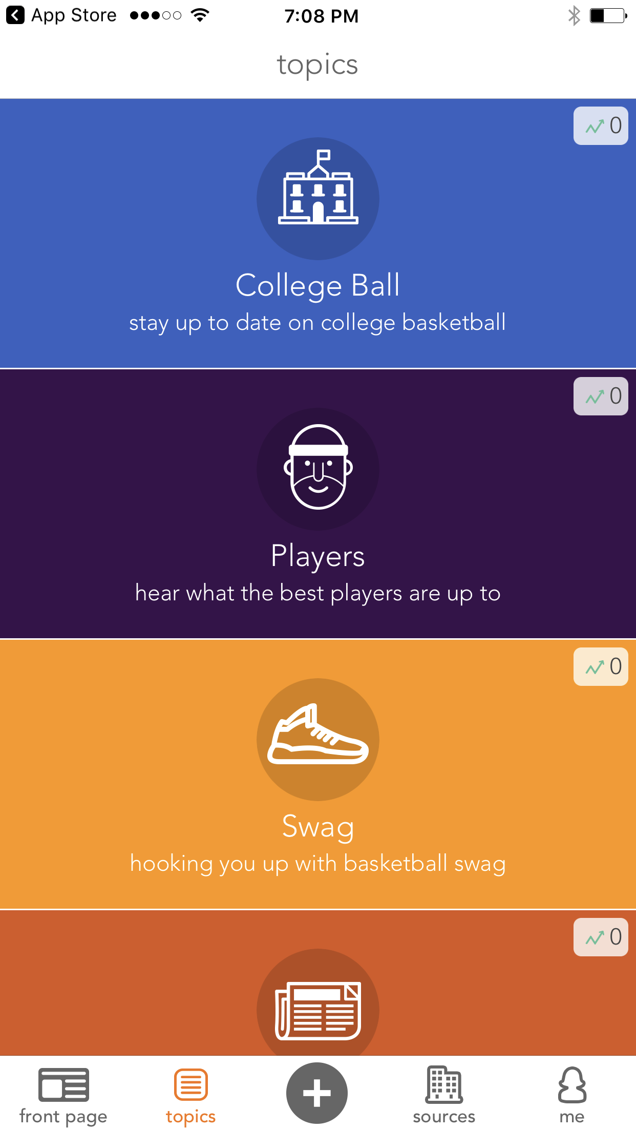
When designing this product is was important to keep in mind that this was intended for multiple topics, sources, etc. One of the main goals was to allow users to track their contribution to certain topics and brag to friends about it. The amount of user generated content would depend on the topic. For example in 3 Points, the basketball app, users tend to be more voyeuristic unless prompted with questions such as "Who is the best guard in the NBA?" It was a little more difficult to get people to post for Goodpoints. People take a big game when it comes to charity, donations and spending time on causes in a way that make an impact.


Branding / Visual Design
Early branding explorations for Goodpoints. It was fun getting back to my design roots and working on some branding. For Goodpoints I wanted the logos to be clean and modern to reflect the subject matter. We wanted the plus to be included because it was such a large part of the functionality of the application.
It had been a while since I had worked with typography and I really got into it. I went back to hand lettering before ultimately picking a pre-existing font. Creating the logo by hand brought me closer to the decision finer details of typography and how to express ideas with it.


Testing the template
To test whether or not we could create another version of the app as quickly as possible and to test out the product with a new set of people and new topic we released 3 Points on iOS. This became a passion product since I love watching and playing basketball. We scraped content from all the top social media accounts including some of my favorite reporters and players. It was a good reminder that you'll do much better at something if you truly have a passion for it.
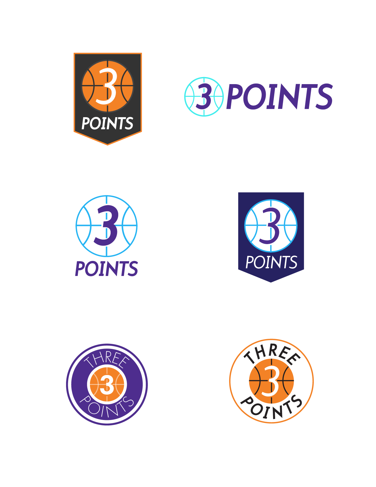
Rebranding
For 3 Points I wanted the logos to be a little more bold and aggressive. The demographic we were going after for both was millennials but I think 3 points would be marketed more towards men. I tried to fit in the "+" no matter how subtle but gave up and decided to try an arrow instead. We were still optimizing so I wanted to evolve the overarching hunhu / Goodpoints brand. If it was a client and not a test app I wouldn't have been so flexible.