
Goodpoints


Goodpoints is a community based news application from a company that I co-founded. It features a front page, topics page and organizations page which are all ordered based on the amount of interaction users have with the content. The desire was to game-ify news content to create highly engaged communities around specifics topics. Below are some high levels product goals.
Product goals
- Create an engaged community.
- Let the community dictate what content is important.
- Transparently reward and track engagement.
- Use knowledge from gaming to add fun, competition, player journey.
Goodpoints is the first step in creating a template that we could use for other topics, company's, IP, etc. It's a product we hope to expand and grow to help facilitate social impact.
I created the UX, visual design and branding in collaboration with the other two founders. The idea is that we could publish apps every week under a new topic using the framework that we have created. In the future we will be iterating on the product based on the data we're collecting and hopefully some user interviews.
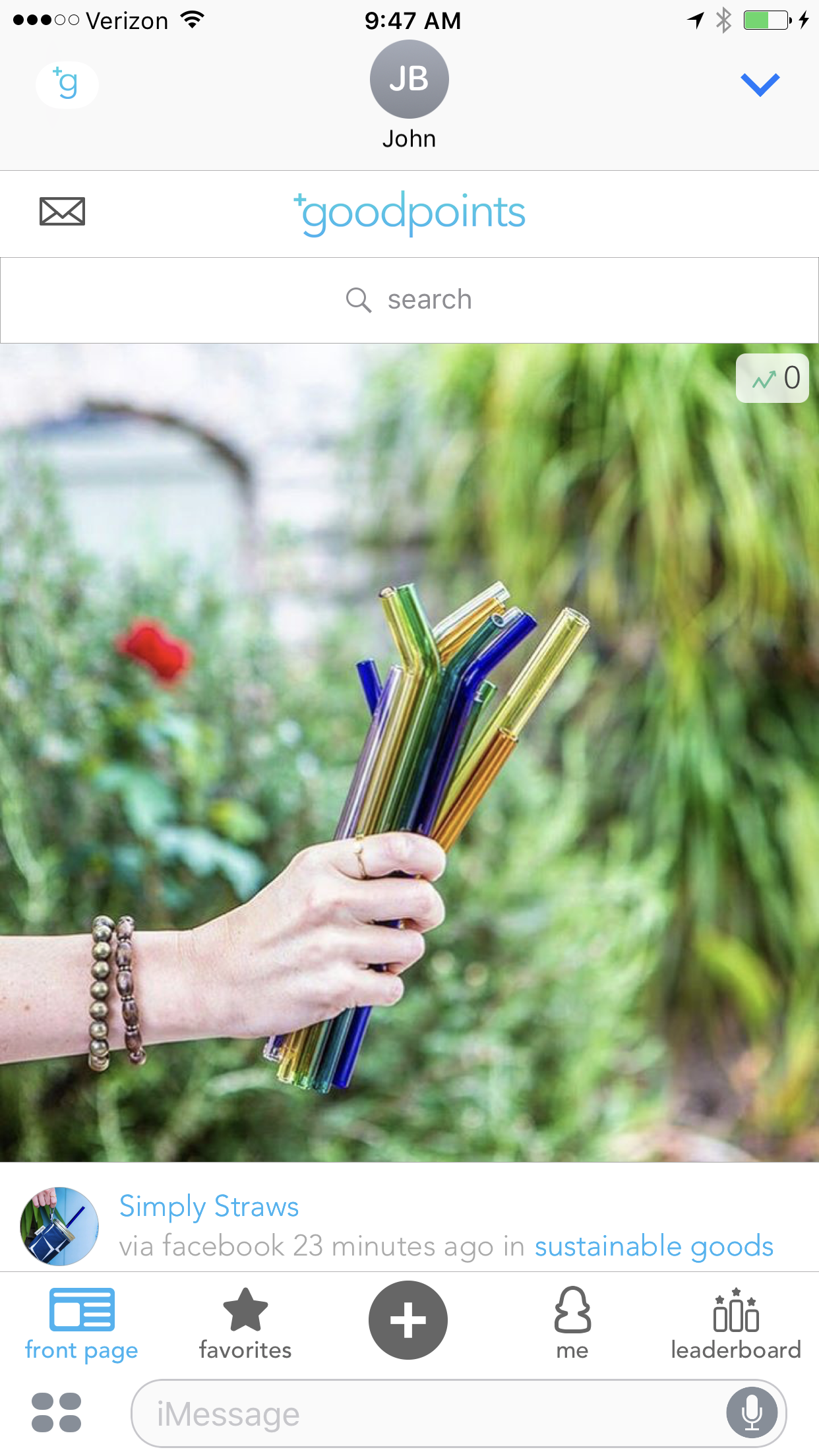
The Front Page
A screenshot of for the Front Page screen
The Front Page features an “up-voting system” that surfaces content that the community cares about. We clearly indicate the amount of +1's a post has so users understands why certain posts are at the top of the list. We focused on the ”+” animation to catch the user's eye and clearly indicate the value of certain interactions. In visual design we were influenced by Instagram's recent redesign and kept the visuals and UX simple. The content should be top priority.
Profile
A screenshot of the final Profile screen
The profile would be a important screen for the user to track their own progress/status. Our hope was that users would strive to earn points for supporting the topics they care about. Those points would ideally earn them credibility and status in the community. Their status would be visible to others through their rank.
iOS in full effect

The template app also included both a widget as well as an iMessage app. We wanted to take advantage of everything iOS offered. Their isn't a lot of competition using those features and we though if we were the first in the space we could own it. We also thought that it could appeal to Apple and maybe we could get featuring. It also makes it really easy to share content which helps with organic growth.


Process
We worked a little more scrappy manner at Hunhu. We would often brainstorm content, functionality and ideas whenever we were able to get together. These sessions shaped the product a great deal but there were little artifacts other than quick sketches like the ones above. In other circumstances I would do more detailed wireframes like the ones below.
Wireframes
Above are some early UX / Product Design wireframes. We had just pivoted to trending content from donations and this was my purposed product design. We have iterated quite a bit since these wireframes but this give you an idea of the functionality. We really wanted the user to feel rewarded when interacting with the content. The purpose of this flow is to show the various celebratory animations the user would receive when interacting with the app.
When designing this product is was important to keep in mind that this was intended for multiple topics, sources, etc. One of the main goals was to allow users to track their contribution to certain topics and brag to friends about it. The amount of user generated content would depend on the topic. For example in 3 Points, the basketball app, users tend to be more voyeuristic unless prompted with questions such as "Who is the best guard in the NBA?" It was a little more difficult to get people to post for Goodpoints. People take a big game when it comes to charity, donations and spending time on causes in a way that make an impact.


Branding / Visual Design
Early branding explorations for Goodpoints. It was fun getting back to my design roots and working on some branding. For Goodpoints I wanted the logos to be clean and modern to reflect the subject matter. We wanted the plus to be included because it was such a large part of the functionality of the application.
It had been a while since I had worked with typography and I really got into it. I went back to hand lettering before ultimately picking a pre-existing font. Creating the logo by hand brought me closer to the decision finer details of typography and how to express ideas with it.


Testing the template
To test whether or not we could create another version of the app as quickly as possible and to test out the product with a new set of people and new topic we released 3 Points on iOS. This became a passion product since I love watching and playing basketball. We scraped content from all the top social media accounts including some of my favorite reporters and players. It was a good reminder that you'll do much better at something if you truly have a passion for it.
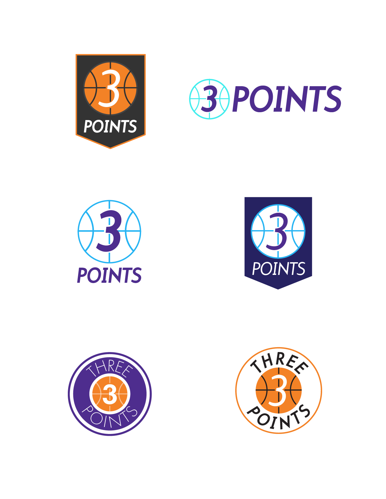
Rebranding
For 3 Points I wanted the logos to be a little more bold and aggressive. The demographic we were going after for both was millennials but I think 3 points would be marketed more towards men. I tried to fit in the "+" no matter how subtle but gave up and decided to try an arrow instead. We were still optimizing so I wanted to evolve the overarching hunhu / Goodpoints brand. If it was a client and not a test app I wouldn't have been so flexible.


Words With Friends


I was one of the first team members on The New Words With Friends by Zynga. The team was tasked with updating a 5 year old game without changing the gameplay itself. A majority of the changes came in the form of new UI/UX and visual design. For the visual design and marketing we looked to evolve the brand while maintaining the friendly and familiar look that the hundreds of millions of people who had downloaded the original had loved. In 2015 I was awarded the Spirit Award for the largest individual contribution to a product for my work.
I created a large amount of the design systems seen in the game including the main navigation system and the gameboard UX. We targeted a few major pain points that were often brought up by user's in our research. We went through countless iterations, did extensive user testing and interviews to come up with the final result that satisfied those goals.
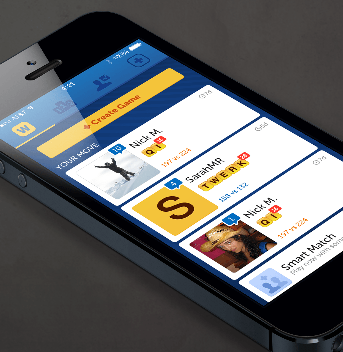
- Create a visual hierarchy with "Your Move" games at the top.
- Allow users to find matches quicker.
- Expose content that was previously buried.
- Allow users to easily navigate on larger phones.
- Modernize the visual design and branding.
The game is available on iOS and Android
Our solutions


Users repeatedly told us that the "Your Move" games were the most important thing on the games list (home screen). To make sure that "Your Move" games were at the top of the visual hierarchy we made the profile pictures for those cells twice as big as the "Their Move" cells.
To allow users to find matches quicker we added the create game page to the main navigation. A recommended Friends section was added at the bottom of the page to reduce clicks. We also created the community feature. Which borrowed its Swipe UX from Tinder.
We created a tab navigation to expose some of the content that was previously hidden under the hamburger button at the top left of the home screen. To increase their ability to navigate on larger screens we introduced a swipe mechanic between main navigation screens. The visual design was a convention that we took from popular Android applications like Pinterest.
Process

An early sketch of the create game / friends screen. You can see an evolution of this sketch in the wireframes below.
Research and Notes
To start any project off I like to gather as much data as possible. This means a lot of player interviews, competitive analysis and reviewing the product itself. I write notes and doodle in my sketchbook. I run tests and experiments to gather as much quantitative data as possible. Whatever I can do to understand the user and their motivations. I'm also trying to solidify product goals, philosophy and strategy. Breaking the product down to find what they call the core loop in gaming. This idea applies to any other software development. One of my favorite PMs phrased it as only a PM could; "find your key metric". Do your homework so you can understand the user and make informed decisions.
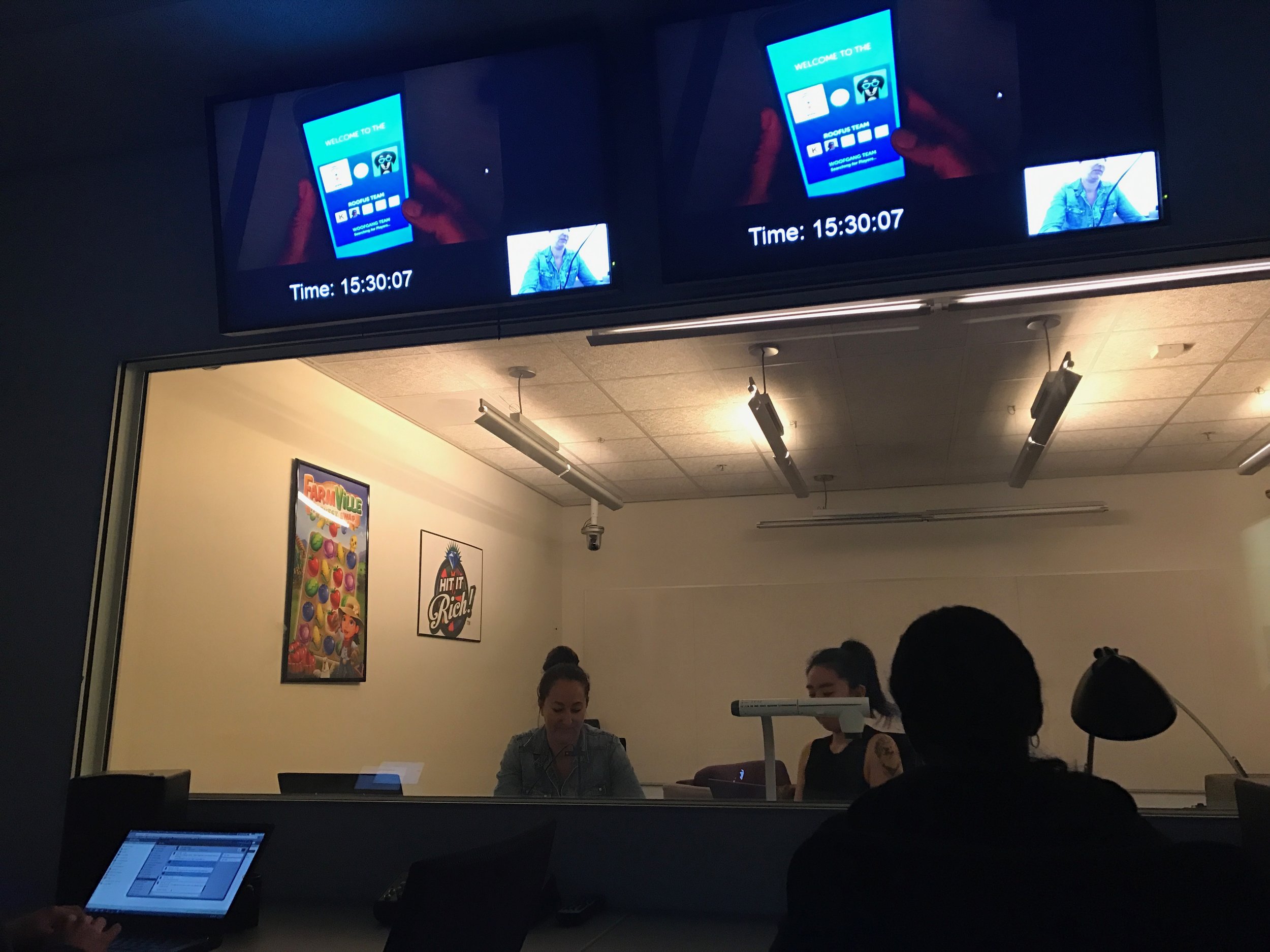
A Lapsed Words With Friends user playing a prototype of a new feature. Player interviews are a great way to get feedback and to understand your users.
It's not just about quantitative data. It's also important to understand the user from a more emotional standpoint if you want to make a connection. I like to get to insight into their behavior in a variety of ways. You can run fake ads to see what creative works best, have players fill out surveys and do in app experiments/tests. We also prototype features and put our work in front of actual users throughout the design process. It's important to move quickly, without too much engineering time being spent. I have utilized a variety of prototyping software including Game Salad, Lottie/After Effects, Flinto, Axure, Invision to name a few.
Here's a link to a Flinto Prototype which we tested with users for a feature called "Fast Play". The password is "whiskey".


One of the Design Challenge sessions I have led with a cross discipline teams. Participants list out criteria and the challenges they may face then they reframe it from a user's perspective. As Associate Experience Design Director its my job to evangelize user centric design principles.
Brainstorming and Sketching
No idea is a bad idea at this point. It's important to cast a wide net. If I'm working in a group like on Words With Friends than a co-working session is a good way to generate ideas and keep everyone involved. It's always better to collaborate with a cross discipline team in my opinion. Sometimes it's not possible or the feature is really small and it's not necessary. I will quickly sketch out ideas in my sketch book otherwise.
I like to create a list of criteria as I go. It helps to be able to remember what's important, visually group them, write notes etc. I also like to list out the challenges. If the challenges are technology based or if they are challenges for myself or the team then I will discard them. This is where I start focusing on the user. All of the challenges should be written from the users perspective. For example if the challenge is "It's hard to find all of them content" than the user statement could be "As a user I want to be able to find what I want" or something of that nature.
The goal is to come out of the first session with a list of principles that you can use to select which features are best for your product. Below are some of the principles we operate with at Words With Friends. From there you come up with specific ideas and features. Focusing on drawing like sketches and doodles as well as writing descriptions.
Sample Words With Friends Design Principles
- Protect the core
- Scalable systems
- Dynamic / Feels alive


UX, Wireframes and Flow Diagrams
Once I have an idea of the content I move to flow diagrams or wireframes in Sketch or Illustrator. It's important to put yourself in the user's shoes at this point so you catch all of the edge cases. When creating the wireframes I keep them to scale so that I don't surprised in visual design. This is about seeing what layouts, content, etc actually fit. I work in grayscale exclusively at this point to avoid feedback on visuals.
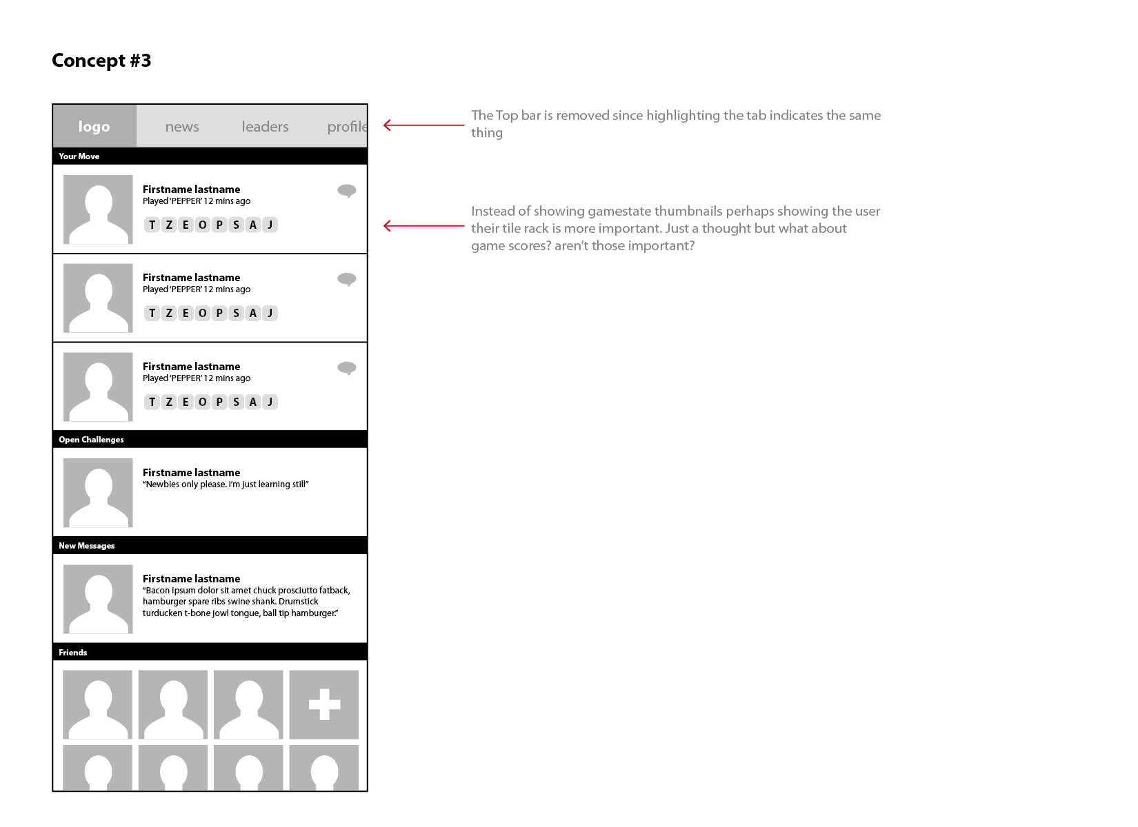
The wireframes above were early concepts for the Home screen or "Gameslist" as we called it. Since we heard in user insights that players love the "checklist" or "Your Move" section we knew the main focus would be the Home screen. The exercise became about which additional content to include, the number of tabs and what deserved a spot on the main navigation.
The final main navigation (see visual design section for reference) was based on a popular design trend on android at the time. It was used by apps like Pinterest and the tab style from the Google Play Store. Swiping from tab to tab allowed users on larger devices to easily navigate from page to page. This was before the Android Material Design guideline had been released advocating for bottom navigation for this same reason.
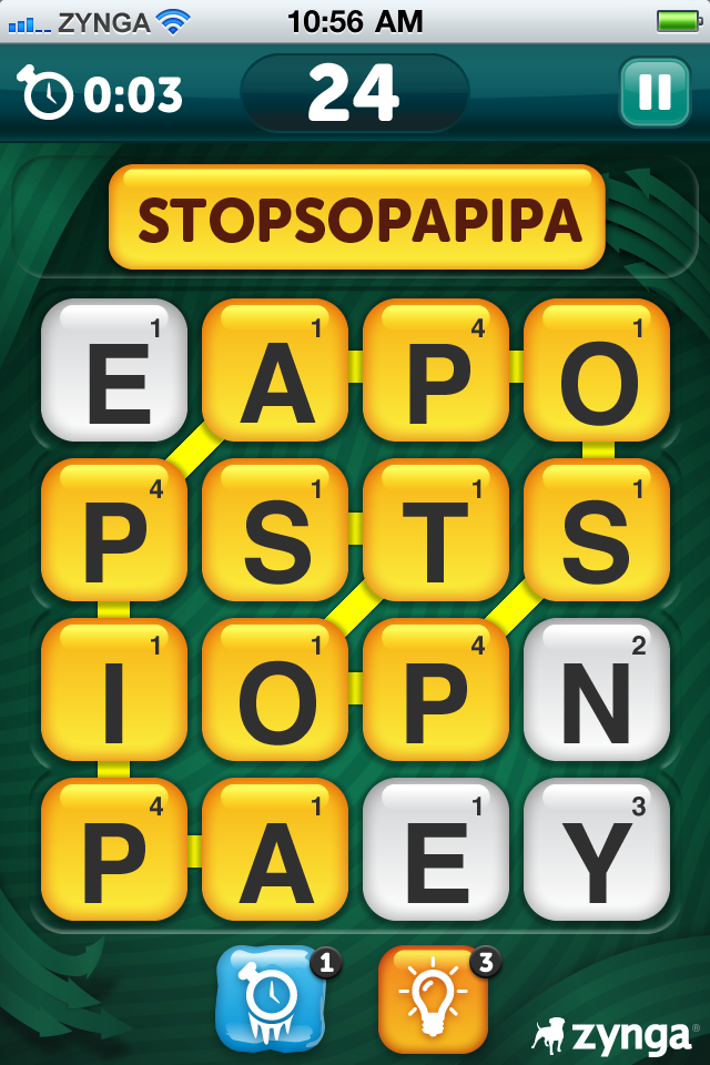
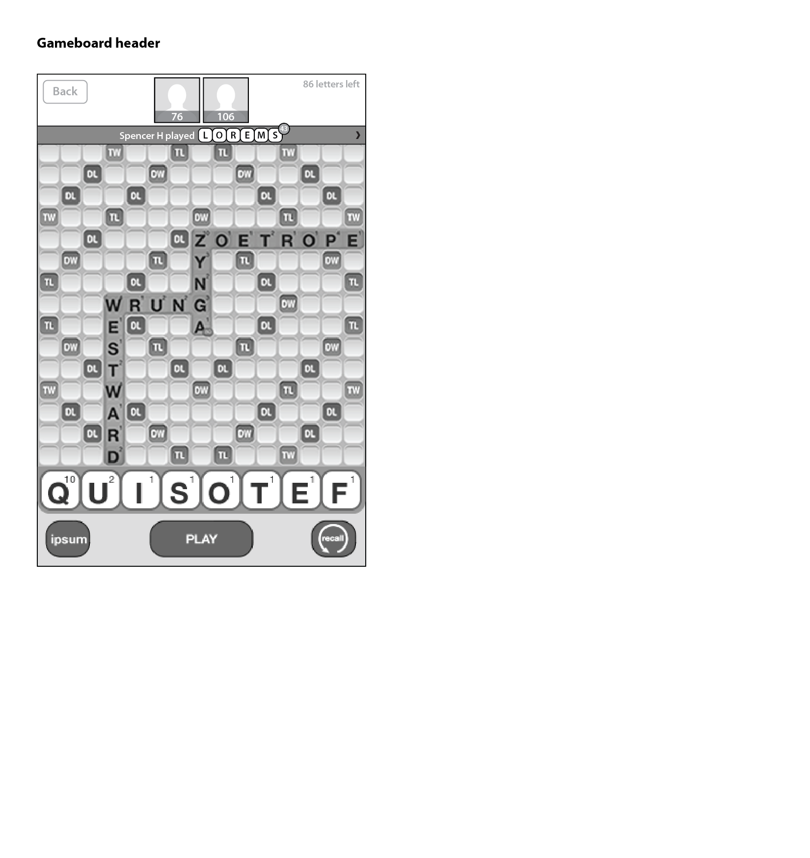
Original Words With Friends Gameboard. Notice there are no images and that the names/score are in tiny text to the bottom left.
Words With Friends is about connecting with people so we placed a large photo of the other player at the top of the screen. I also advocated that more prominence be given to the name and score. In the original Words With Friends the name and score were buried in the bottom left hand corner in very small print. As you can see in the screenshot above there was no photo at all. The Gameboard wireframes above are all explorations of the header with various sizes and positions of the elements.
A lot of the time design is about simplification. This was the case with this screen as well. In order for the user to be able to concentrate on their tiles and who they were playing a lot of elements needed to be removed or made contextual. We used Data from the original Gameboard to make these decisions. The less engagement a feature got the more it was buried.


Visual Design
I personally find Photoshop to still be the best tool for visual design. It has a robust toolset that allows you to get far more granular than say Sketch. When starting visual design I always start by taking a look some of the competitors and then picking my favorites. A big influence on the final design was Ruzzle.
In this stage I like to provide a couple of options with a spectrum of styling options. I'm still playing with UX at this point. Tweaking and iterating based on the fact that I am now counting pixels. For Words With Friends I was working remotely so I needed to have these documents speak for themselves. Usually I would present these in person and talk through the finer details. This was only the first round of concepts I did for "New Words". Part way through the process iOS came out with the new flat look.
The explorations below show the evolution of the visual design. We starting exploring after screen #2 below which was when iOS 7 was released. We found that balancing a flat style with the art style usually found in gaming was quite difficult. The screens below show an evolution that took almost a year. The first screen is the original Words With Friends. The last screen is the current style seen in the App Store.


Working with Engineers
Due to my limited coding ability I need to collaborate with Engineers to make mobile products. To bridge the gap in skill sets, perspective and experience I prepare detailed spec sheets so that the Engineers know exactly what I want. This helps hold them accountable for delivering pixel perfect UI. Over the years I've evolved the guides to include more and more. I also put together style guides for engineers. The images above are from one that I created for Words With Friends.
Despite all these documentation I also find it important to go over the engineers implementation. In fact you should be testing over, over and over again. I will often provide "Design QA Specs" for the engineers to red line, call out and correct issues.


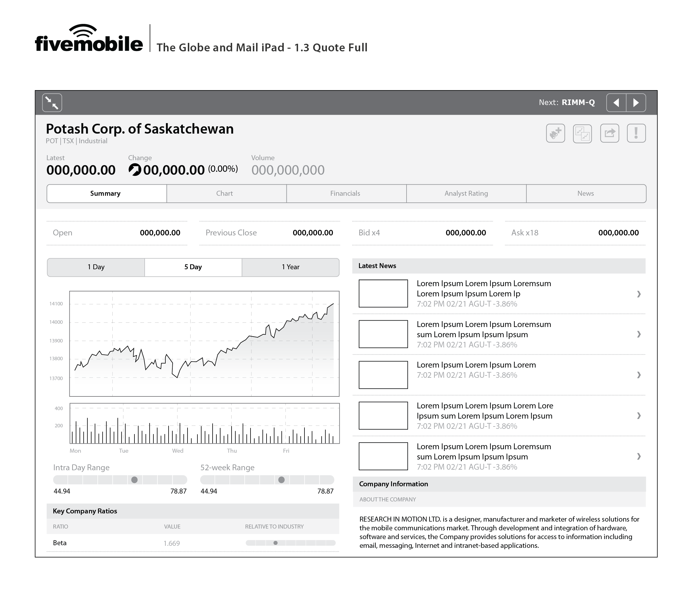
Globe Investor


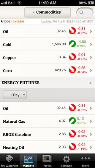

We were approached by the Globe and Mail to create the Globe Investor app for iOS, Blackberry, and iPad. I art directed, designed the user experience, created the mocks in photoshop for iOS and iPad, and coordinated the production of assets for all 6 resolutions (gasp!).
I loved working with the Globe and Mail guys. They were super smart. We collaborated the entire way through and they pushed us to justify our decisions. At the time their wasn't a lot of great mobile prototyping software. So we had to iterate on software on device.
In creating this application we needed to give the user to access specific stocks instantly while also being able to browse the colossal amount of content the client's website contained. We created a number of systems to solve this puzzle including a robust search and by centering the home screen around the "My Watchlist" feature. The app was later voted one of the top financial apps of 2011 by Apple Canada.


Wireframes
The clients goal was to include 60% of the Globe Investor website into the mobile application. Through an extensive brainstorming / wireframing process, we achieved the 60% and more, creating a product that has been the clients most successful app to date. I've posted the basic flow from cold launch to detail view for iPad above.
Since iPad is a slightly different use case than phone we showed more information on the screen including a ticker with the user's "watchlist" of stocks they were following. I thought the more realistic use-case for the Globe Investor was more inline with the habits of an iPad user. After interviewing investment bankers, and stock brokers I realized that it probably wasn't a good thing to be constantly checking your stock's value. Having it on your phone was less useful in that case.


Working in multiple resolutions / platforms
A couple of concept mocks to illustrate the platform specific UX for Blackberry. I directed a junior designer who worked on this platform but didn't have much mobile experience. In total we had to provide mocks, assets and spec sheets for 6 resolutions over 3 platforms. That didn't include iPad which we never finished because we were aquired by Zynga first.
It was common for us to be working with all 3 major platforms (Android, BlackBerry and iOS) so we were well versed on the platform specific conventions and how to port an app from one to another.

LifeTales


LifeTales is an app that allows families and friends to share and preserve their fondest memories. The app lies somewhere between Storycorps and Facebook. I designed the UX, created visual mock ups, suggested functionality and oversaw 3rd party designers. Since I was one of the only members of the team with Mobile Application experience it was my job to communicate and educate the rest of the team on platform guidelines for both iOS and Android. One of the most difficult challenges with designing the app was that the target demo was older and we were often surprised of the results when testing with our target audience.


Sketches
My motto is always do one thing well before you try and add additional functionality but it was extra important in this particular case. Since our users would usually older we focused on getting them to create a story as quickly as possible. That meant large buttons that took them to the camera or audio recording screen in as few click as possible. I also advocated that most secondary screens stick to one primary use-case.
Showing large pictures of the user's friend and family was also important to me. People were being asked to tell intimate details about their lives. I think we can all admit how hard and awkward that can be sometimes. We decided to show pictures of the people that were in the story during record mode for this reason.


Wireframes
Some of the numerous UX explorations and flows I did for LifeTales. Since I was working remotely from the team I had to be diligent in my documentation. It was a good reminder to be detailed when explaining your work/logic and also to take notes while you work. The wireframes above above are some of the main flows; the various create flows, invite and the FTUE logic/flows. These are nowhere close to final and we iterated on them constantly. There was a point with the FTUE where I took a step back and realized that if we're having to explain so much to the user they probably won't get it. Remember the target demo was between the age of 45-65. From then on I became an advocate of simplicity.


Working remotely with engineers
Documentation is important when working with engineers but its also important to be able to work things out together. Working remotely makes that difficult. My spec sheets needed to be very detailed since the engineers were in Toronto and I was in SF. To make matters worse some of the engineers were very new to mobile development. Above are some of the numerous spec sheets I did for the project. I also did frequent calls to go over spec sheets and UI implementation.

eMarketer Application
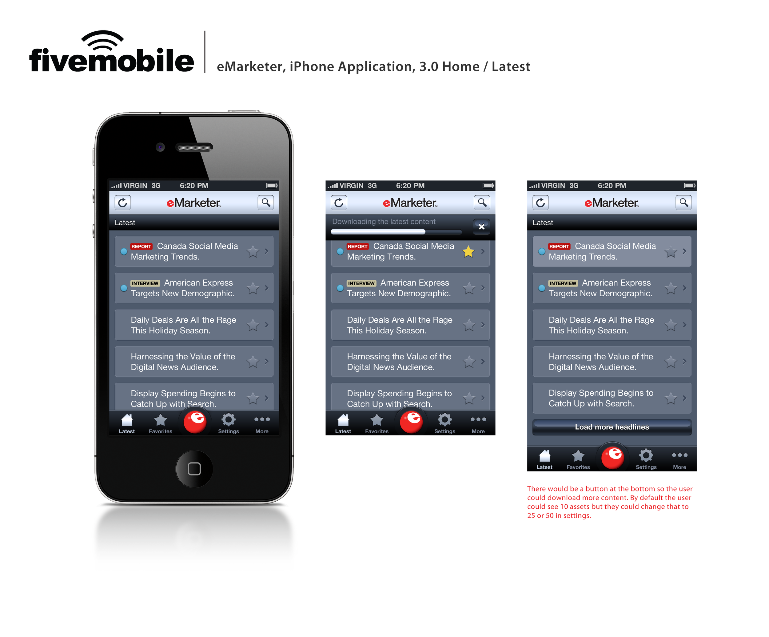


At Five Mobile I worked on around 10-15 mobile applications. One of which was eMarketer's application for it's premium subscribers. It as created for iOS and Android and we had some platform specific differences. Not captured here. This application was meant to be used to read their vast library of marketing and tech related articles and resources. I designed the UX and visuals starting and helped shape the product to fit the mobile platform.
For the main navigation we made the user's saved articles the most important item visually the bright red color for eMarketer's palette. Some of the elements are clearly over-stylized in hindsight but that direction often came from clients who wanted to differentiate themselves in the skeuomorphism days. This convention became very popular later on with apps like Instagram incorporating it into their application's UI.
It was easy to put myself into the users shoes for this product. The articles were very interesting and relevant to mobile product design. They have changed the UI to a more flat style but the app is still available although you need an account to read the articles.


Wireframes
Some final wireframes created in Balsamiq. We found using Balsamiq and other low-fi wireframes tools were a great way to force the clients to focus on the content, experience, and functionality.
Our goal for the UX was to give the user the ability to find the article they're looking for within a couple clicks. We focused on favorite articles, search and user customization to achieve those goals.

The Score - Pitch Concept
This was a concept mock for The Score. One of my favorite clients at Five Mobile. I started with wireframes in Illustrator and designed the final UI concepts in Photoshop. The mocks were for a pitch to redesign an existing client's application and unify their design across 3 platforms (Android, BlackBerry and iOS). The visual design was very skeuomorphic which was the style at the time. I created these in late 2010 / early 2011.
The goal of the UX, specifically the top drawer, was to fit all of their content within a couple of clicks. This was extremely difficult given the amount of content and the frequency in which the data was updated. Unfortunately I've lost the original wireframes due to my computer crashing so I can't display them here. Our company was acquired during the concept / pitch stage and the project was paused. They used a similar UX system for their app when it was eventually released.
Pitching to clients
3 concept screens which also show purposed UX as well as revised visual design. These were the 3 screens that we choose to pitch to clients. I often led presentations to clients at Five Mobile. I worked hard on polishing the heavily stylized skeuomorphic visuals. Including the scoreboard style display on the game detail screen and the mesh texture on the top drawer. I'm a big sports fan so this was a super fun project for me.