
Step Premium
Overview
The initial launch of Step, the mobile bank for teens, was successful. Millions of teens had signed up for accounts and we had built the foundation for an all-in-one bank since we had introduced savings, investing and other key features for our younger users. We had proven that we had product market fit with younger teens. As we looked to the future we wanted to start appealing to older teens and adults (16 - 24 year olds) who were much more valuable for the business. We had learned that a key to acquiring and retaining that audience was getting teens with jobs to put their paycheck directly in to their Step account.
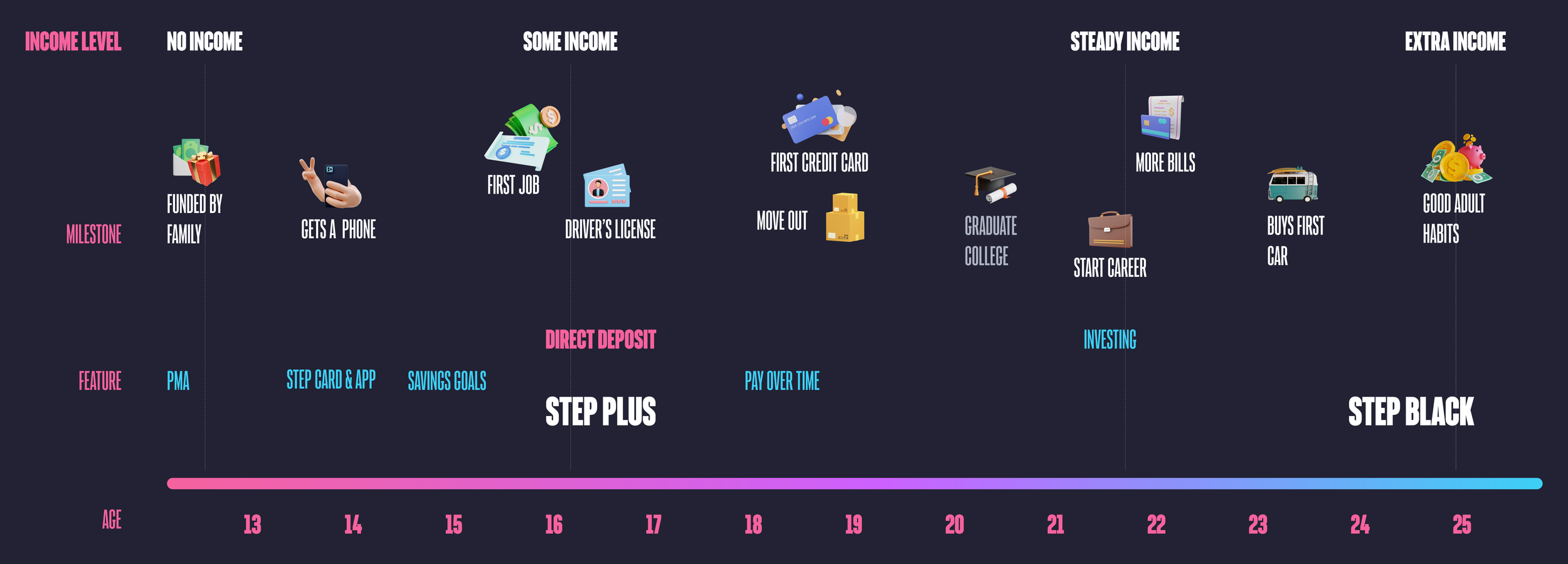
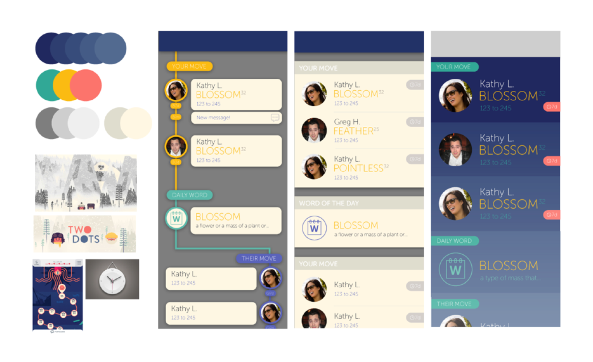
An updated customer journey with Step Plus and Step Black added
Goals
Retain users by incentivizing them to connect their direct deposit or purchase a yearly subscription.
We knew we wanted to incentivize direct deposit but needed to work with the product and finance team to ideate on a package that brought real value to our users. We called this package Step Premium and we thought we could come up with two tiers originally. A lower level called Step+ and a higher tier called Step Black. Customers would get a credit for connecting direct deposit so that Step+ would be free. Step Black was meant to be aspirational for most of our users and help elevate the Step brand. Once we had a general sense of what we could afford to offer for each tier but needed to flush out the details to make sure it resonated with our target audience.
Basic feature set
Interest on Savings Goals
Increased rewards
A metal credit card.
Challenges
This was an incredibly high stakes feature for Steps. A lot of time, effort and money were going into it. We were also targeting an older audience for the first time. Our strategy was always to acquire users when they were young, to develop a good relationship with them so we could serve their needs when they were adults and their business was more profitable for us. It had other challenges as well.
This feature spanned 3 internal product teams, marketing, and the executive team.
The seasonality of teen finances required a launch by the end of the school year to capture direct deposit for summer jobs. It was already January.

Research
Since this was our first real push into the 18+ market research was an integral part of this project. I found the conjoint analysis was particularly effective at helping us shape the feature. It helped us prioritize features and help decide where to put our effort and money based on feedback from a large sample size of our customers.
Interest on Savings and metal Step Cards were highly requested features on Acute (software that allows users to submit feature requests and others users can upvote them)
Conjoint analysis to help guide messaging and find out what was important to this new audience.
We conducted user interviews that included generative exercises and concept testing.

The optimal Step Premium package according to our conjoint analysis
Key Takeaways
The metal card was less important than we thought.
Fees / price are really important
Users wanted interest on savings but didn’t know what APY stood for.
Users knew they spent a lot of money on food so increased rewards on food purchases resonated with them.
With these results we decided to remove the metal card for the Step+ or the direct deposit tier as we began to call it. The cost for creating a metal card was more than the $39.99 price that came out on top in our conjoint analysis and other features seemed to be more impactful for our customers.
Design
To make sure design was efficient I led a collaboration session in-person with all the stakeholders. We aligned on requirements, and the basic feature set. We also highlighted and made key decisions that affected the UX. I used very basic wireframes to express the ideas and prompt conversation. Overall the team and I thought this was a very productive session. The entire doc can be found here.
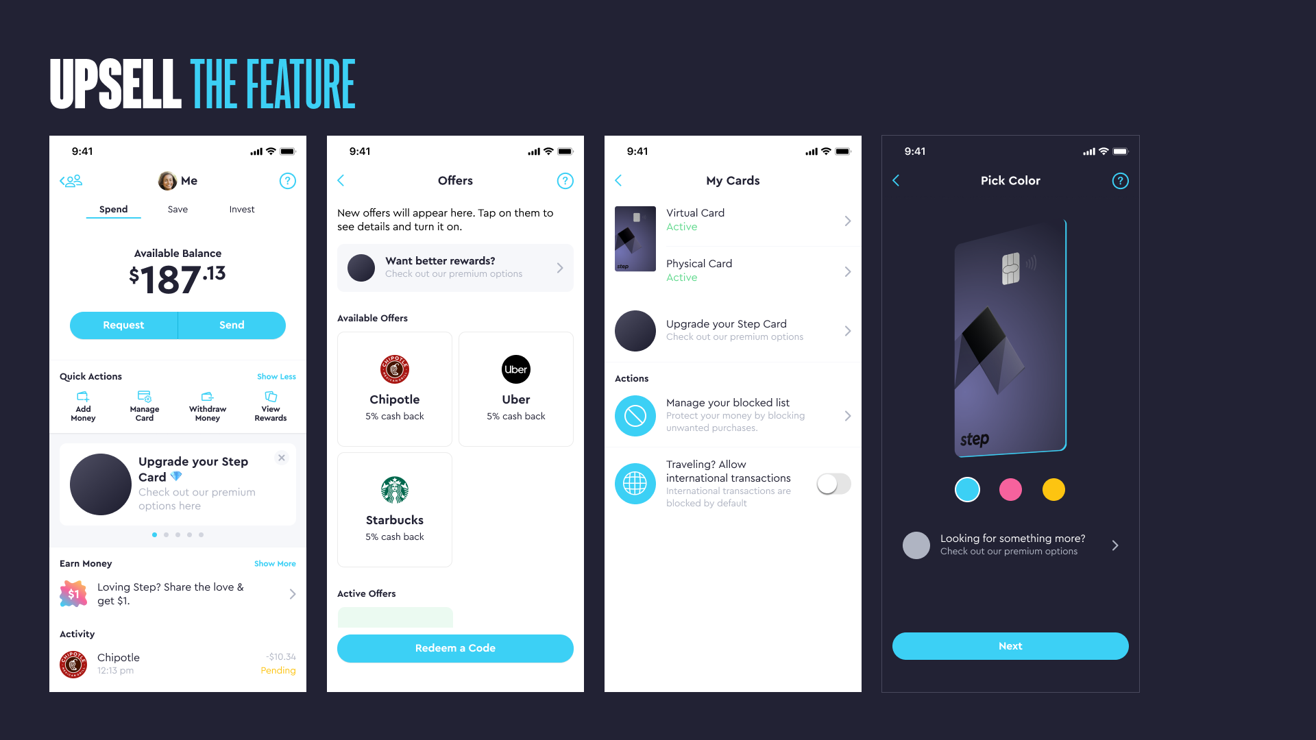
A slide from the presentation I created to prompt discussion around the initial surfacing of the Step Premium upsell messaging.
After the session we began the real work; designing more concrete flows, wireframes and UI design. At this point I delegated some work to the designers on each pod that had engineers working on the feature. My role became more to drive product design strategy and project manage the design process including the hand off to engineering. Here’s how I managed the process:
Driving Influence
I met with different teams privately first to address feedback and before presenting to the larger group.
I focused and refocused the conversations back to achieving the goals versus granular feedback on the design work.
I spent a lot of time discussing with our CEO and CTO to make sure we were in alignment and that their feedback was addressed since they were the final decision makers.

A screenshot of my Step Premium file with pages indicating content, release milestone and status of the design.
Communication
To start I recognized that documentation would be key. There would be so many people reviewing the designs asynchronously.
I created a clear structure and organization to the figma file so teammates understood the status of each part of the feature.
I added a ton of notes to the flows to help provide clarity, logic for engineers, ask questions or request feedback without requiring me to be there.
I also recorded loom videos with me describing the file structure and walking through the designs so that the team could get a detailed overview.
Branding each tier
Once the in app flows were nearly complete I focused my energy on the branding of each tier. We brought in inspiration from other banks, apps and generated images from midjourney. We had changed the plan and now we were releasing the tiers separately both in release timing and conceptually. I held multiple jam sessions with the design team where we worked on the visual design together. The combined creative energy seemed to take us to the next level.

Key screens for the direct deposit tier formerly known as Step+
Direct Deposit Tier
We had decided to roll the benefits of this tier into the marketing of the regular Step Account with the stipulation of having to connect direct deposit to earn them. That meant that from the design side we wanted to stick closer to the original Step branding and visual identity.

Key screens for the Step Black feature.
Step Black
Starting with the metal Step Black Card we created the visual identity and brought it in the app. Step Black users would also get exclusive UI themes. I also worked with a freelance animator named Travis Ragsdale to create a hype video used in the app, on our website and in marketing. I was super happy with the final product.
Conclusion
We launched the direct deposit tier in mid-May (2023) in time for teen’s to add their direct deposit from their summer jobs. So far it helped us set new daily funding records and a dramatic increase in overall funding. It’s still very early, I’m writing this in mid-July.
Step Black had yet to be released but we have announced it and the response has been great. We have a waiting list of 80k and growing.
Impact and Results
Almost doubled customers with direct deposit within months.
Increased overall funding substantially.
Created a waitlist of 80k customers for Step Black.
What worked well
Having alignment on requirements and big decisions upfront allowed for an efficient design process.
Spending more time with our executive team and key decision makers allowed design to execute quickly.
Focusing on organization and documentation of design artifacts made it easy to review asynchronously and communicate information to everyone involved.
What didn’t work well
I should have spent more time with engineering during the implementation process to make sure they were more aware of last minute changes, etc.
I’ll update this case study with more results and final thoughts once the feature has been out a little longer.

Designing a banking app for Gen Z
Product Overview
At Step, our mission is to improve the financial future of the next generation. Our first product was a secure spending card that helps build credit and an app to keep track of your spending. The goal was to become the largest bank for Gen Z in the United States.
My role
In April 2019 I joined Step as the Head of Design. I was something like the 10th full-time employee, there were no designers, a basic brand identity from their website and an app with a referral leaderboard.
Prior to my arrival the team had launched what they called the “Referral App” which had created a substantial waitlist by offering users $1 to invite their friends. The app featured a leaderboard incentivizing users to invite friends but no banking features. While we finalized details on the physical card, I was tasked with designing the banking app.

Timeline of the launch of the Step app
Defining the problem
My task was to design the mobile application for a bank for teenagers.
Making sense of a big problem
To understand the founding team's vision, I ran design sessions and met individually with cross functional leadership. We discussed examples of "best in class" competitors and what we liked and disliked about them. Together we collected a list of requirements, functionality and features that needed to be designed and then built.
Basic feature set for teen users
The Step Card (a secure credit card)
Spending (Checking) Account
Peer to peer transfers
The ability to link a debit card
Research
To get some understanding of the audience I created an interview guide and began conducting interviews with teenagers to understand their attitudes and behaviors.
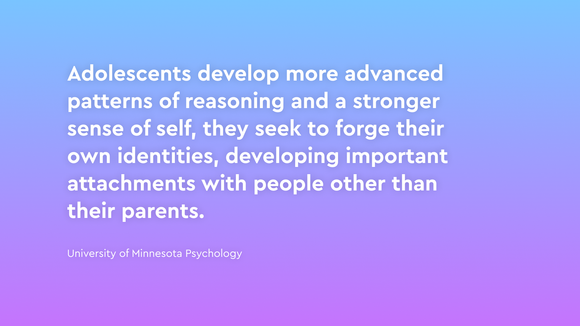
I also read numerous reports, articles, and studies to gain a balanced perspective on Gen Z. I found material on the psychology of adolescence to be particularly interesting.

Key takeaways
Experience and knowledge of banking and finances was lower than we thought.
Most people get their first bank account around 14 years old but experience with finance varies… a lot.
Both children and parents wanted financial independence for the child.
Young people didn’t have a lot of money so checked their balance frequently.
Based on all of the research we prioritized jobs to be done, created design pillars, and user personas. These artifacts helped provide structure and direction to the design process.

Design pillars from the initial launch
Jobs to be done
Viewing my balance - Do I have enough money to make a purchase?
Transferring money - I want more money
Financial Health(?) - Where did my money go?
We started the design process prioritizing these actions.
The design process
Starting with high-level "movie poster" concepts, I collaborated with stakeholders to align their vision. These concepts helped us pick our favorite UX patterns and start to organize features and functionality.


We had a very limited feature set at time of launch so after considering several options, we went with a simple version based on concept 1 that focused on the top jobs to be done (Account balance, transferring money to other people, and the past transactions). As we began to finalize design decisions, I formed the spec to document them.

Final App Navigation is simple and focused on balance and P2P
Once I had the basic structure of how the app was organized I started to flush out the UX for each feature like P2P. There was a lot to do so at we hired a junior product designer (the talented Olivia Ouyang) to help with the workload. I was able to delegate functionality and flows which allowed me to think about the big picture a little more. Figma organization became super important once there was more than one person working on the files. To maintain quality and consistency I started creating a design system with basic components for the app.

First version of the peer to peer transfer flow in the Step app
At this point we recognized that we needed to create icons, illustrations, etc., but hadn't discussed the art style or visual identity. So the design process took a little detour while I worked on that but at least I had Olivia to continue to work on the app.
Defining the visual identity
We created personas, brand pillars, and guidelines based on our prior research. And after collecting art inspiration with the team, we explored a revised art style that aligned with our brand pillars.

Initial brand pillars for Step launch
I created moodboards with inspiration and competitive analysis that we thought demonstrated the characteristics of our brand pillars visually. These helped guide our own explorations.

These were some of the top examples that the team liked from the moodboards I created.
We created example illustrations internally and hired an agency to create some. The goal was to explore a variety of styles. Below are some samples.

Early explorations created by Olivia Ouyang, Fireart (a digital agency) and me.
Below is the art style that won out in the end. The teens we interviewed liked it and we were happy with the result.

Examples of the illustration style I created for the first version of the Step app.
Early Product Testing
As engineers started work on the app we finalized the art style directions we wanted to show and created a robust prototype of the app design. We recruited teens that the team knew or customers from the referral app to help give usability feedback and guide our decisions. We did picked a final art style and improved important flows like onboarding and transferring money.

Parents couldn’t find their teens account in our usability sessions
Usability Feedback
Sponsors found it difficult to find and fund their teens account.
Users favored the art style with doodles and photos combined.
We quickly tested some solutions to make it easier for parents to fund their teens account. Product education like the gif above didn’t seem to work so we ended up added some more explicit arrows to guide them (image below). A larger change was made right after launch that solved the problem more completely.

Soft Launch

Starting in December 2019, we began testing the real product internally and with friends and family. We then added real users from the waitlist, starting in January 2020. In May, we opened up the app to all potential users but in stealth mode (no marketing).
As we rolled out our product we wanted to test the basic functionality and monitor key metrics to identify areas we could improve before putting marketing dollars behind a public launch. The biggest problem we wanted to fix was with onboarding conversion. It was challenging to onboard two different users (parent and child) to the app but it was required since children can’t open bank account without adult approval. We focused our efforts on these moments:
Soft Launch Objectives
Increase requests sent by children
Increase the number parent’s accepting requests
Next we wanted to talk to users to find out why they weren’t completing these steps and collect general feedback on the app.
UX Research - Real Customers:
Next we conducted moderated interviews with 15 teenagers and 10 parents and surveyed hundreds of responses. We focused on teens since our research showed most children get a debit card around 14 years old and to avoid COPPA restrictions. The surveys and interviews provided more insights into general attitudes and behavior, and usability testing helped identify teens' pain points.
Pain points
Teens didn’t think their parents would approve
Teens didn’t think there parent’s had time
Customers had concerns about the app's legitimacy.
Customers still had concerns about entering sensitive information.
We were missing basic features like ATM, Savings, etc. that they expected from a bank.
UX Optimizations and Experiments
To improve these metrics and pain points we ran onboarding conversion tests which came out of targeted design sessions I ran. Below is a list of some of the experiments.
Forced the child to ask their parent for approval during sign up.
Gave the child talking points to help in person conversations with parents.
Added web landing page to provide parents more info.
Added a primer to prepare sponsors for entering sensitive information.
Added recurring payments (Allowances)
Added the ATM feature.

Basic UX for setting your ATM PIN. We were shocked by how many teens wanted access to cash in our soft launch.
Unsuccessful tests
When it comes to growth I think building a culture of learning is important. So in the spirit of promoting experimentation here is a list of unsuccessful tests we ran:
Web sign up flow.
Videos on our website landing page.
Reducing and reordering the onboarding steps.
At least 1,000,000 messaging tests
Different referral amounts and reward criteria.
Sending articles on Step in messages to parents.

Thumbnail for a test video sent to parents of teens that want to join Step. One of many unsuccessful tests we ran to improve onboarding conversion.
Soft Launch Results
By the time we were ready to put marketing dollars behind a launch we had achieved the following results:
Improved overall teen onboarding conversion
Improved parent conversion
Added 2 of the most highly requested features by customers.

Early tiktok post from Charli D’Amelio
The public launch
We officially launched Step on September 26, 2020. We partnered with the biggest TikTok influencer at the time Charli D’Amelio. By the end of 2020 we had over a million accounts created. Here’s some key learnings I took away from the experience.
What worked well
Being live for so long before our public launch let us better understand the audience so we could optimize flows and improve their experience.
Having a clear list of requirements made building the initial app faster and more efficient.
What didn’t work
Focused too much on optimizing flows and not exploring some new, larger ideas as well.

App Store screenshots of our peak on the app store during launch
Conclusion
Overall we were super happy with the launch. The initial app included all of our requirements plus some additional features. While the timeline was longer than we hoped our initial user growth really exceeded our expectations. Step still has a long way to go before becoming the largest banks for teens in the US but by all measures the launch was extremely successful. Here are some highlights:
Highlights
#14 overall on the app store (peak)
#2 in the finance category on the app store (peak)
1 Million teen accounts by the end of 2020

Words With Friends Design System
I’ve been interested in creating a design system for Words With Friends since Airbnb began publishing articles on their system way back in the day. The engineering team recently decided to change our code base from Native iOS and Android to React Native so I felt like now was the time to push for a Design System like theirs. I attended a presentation at Slack Headquarters about their system that left me more educated, motivated, and with a plan to get funding for the project. The thing that was immediately clear was that I needed to get an engineer or two onboard. As I dug in I also realized I knew less about the capabilities of Sketch and its plugins than I would have liked to admit at the time. There was a lot of work ahead, but I was excited and I knew what I wanted to accomplish.
3 Goals for the Design System
Increased velocity
Increased consistency
Common language
We decided that if we wanted to get buy-in we should focus on the first goal so that’s where we started. I also knew that some of the best engineers, and designers for that matter, want to work on the cool, new thing. Finding talented, passionate people to collaborate with was not difficult and getting buy-in was pretty easy once the benefits were laid out for the major stakeholders. For those struggling with getting their project funded here are some of the many other benefits for creating a design system. We’ve found they increase quality, make on-boarding / knowledge transfer easier, reduce unique declarations/components, make sharing ideas easier, give more people the ability to design / prototype / code, and are helpful for PR / recruiting.
Perhaps it would help if I defined what I’m talking about a little more. A design system is really just a formal process and the documentation associated with that process. For us it came in three parts outlined below.
Design. The workflow should allow designers to update/save from sketch and make their work available to the engineers as close to instantly as possible.
Code. A more streamlined workflow that allows engineers to easily find and use components / modals /styles that they need to build features.
Documentation. All of this would be documented dynamically and viewable online for team members and 3rd parties to use and learn.
What was involved
Converting all of our files to Sketch and creating a robust library of symbols / components was the first step. For Words With Friends it was a total of 54 screens, 600+ components, and still counting. I needed to do an audit of the existing working files and design specs to get a sense of where we were. Our files were a mess, scattered in pieces of photoshop and sketch files. It turns out I basically needed to create all of this from scratch since the files were not set up in a way to create a library. A past employee had taken a stab at creating the libraries, but they weren’t created in collaboration with engineering. If you want your Design System to be something both disciplines find useful, frequent communication between Engineering and Design is essential. Make sure to include them in setting rules for naming layers, files, and file/folder structure as well. Big shout out to Peter Turner and Himanshu Masand for their hard work, input and can-do attitude. Creating a design system is definitely a team effort and it was great working with such talented, passionate people. Find people who are equally as invested and motivated as you are to make it happen. While it was easy to get buy-in for the system, we still had a limited window of time to execute it. Some things could wait, but we needed to build the foundation as we made the transition from Native to React Native. Pete was a rock star here, he built the system in a way that was easily scalable. I’ve outlined what we accomplished in Milestone 1 below. This was all done in little more than a month’s time for the most part by Pete and I, but with constant discussion/collaboration with the other engineers and designers — some of whom I call out later.
Milestone 1
Created Sketch libraries for existing screens and features.
Decided on basic Design -> Engineering pipeline.
Sketch files are checked into git as libraries.
Created a script that gets font and color data from a Sketch file and converts them to JSON with Typescript interfaces.
Using Zeplin to for additional specs and details in the short term.
Built in a way that allows us to expand our capabilities down the road.
Here’s a peak into the main symbol library and structure of the components. For a game with over 50 screens there are 600+ so organization is key.
A big part of this project was documentation. Since this was to be used by engineers and designers in multiple locations it was important that the documentation spoke for itself and that people could use it without much guidance. Here is the link to version 1 of the Sketch Process documentation and the guidelines for naming files.
Our short term solution for missing data (text wrapping, responsive layout rules, etc.)
Basic Workflow
Since efficiency was an important goal we wanted to limit the amount of time designers spent preparing files / assets /specs for engineering, as well as the amount of time engineering spent implementing, and polishing UI. For both disciplines it was important to make things quicker and easier. We experimented with a lot of software — Zeplin, Fractal, Sketch, Measure, Craft, etc — but ultimately the solution we landed on was to take the data straight from Sketch itself. Zeplin is being used in the short term to document some additional specs. Here’s the designer and engineering workflow.
Design
Design as usual in Sketch.
Create library with screens and symbols from original Sketch file.
Push to git.
Engineering
Pull libraries from design repo.
Run script in code repo which generates design data and Typescript interfaces for the game to use.
Use data in game.
What’s next?
This is just the beginning for Words With Friends. We’ll continue to refine the process as we use it and as new team members join the team. We also want to increase the capabilities and eventually export more complex code such as entire React components that we can use in game. It would be cool to build some prototyping tools as well, maybe even bringing code back into sketch so that prototypes use real data. Design, Engineering and other disciplines will continue to collaborate and discuss their needs and abilities. This process should evolve to suit those needs and pursue the goals that we started with. Efficiency, quality and communication can always be improved. For the design team this system allows us to focus on the big design decisions. The ideas, strategies and experiences that our players will love, not the minor details that can be distract from what’s important.
Continue building out additional components and screens in sketch (gameboard, tile melds, etc.)
Select software to create dynamic brand guidelines from sketch.
Use more data from sketch files (margins, positioning, stretching rules, etc).
Support for override sketch files (like for theming)
Image support in the pipeline (auto copy only images used)
Exporting useable react native code from sketch.
Continued brainstorming, updates and collaborations between design and dev.
Special Thanks to the following people. I’m sorry if I missed anyone.
Peter Turner
Himanshu Masand
Neha Belwalkar
John Bacon
Brian Tse
Originally published on the Words With Friends Engineering blog

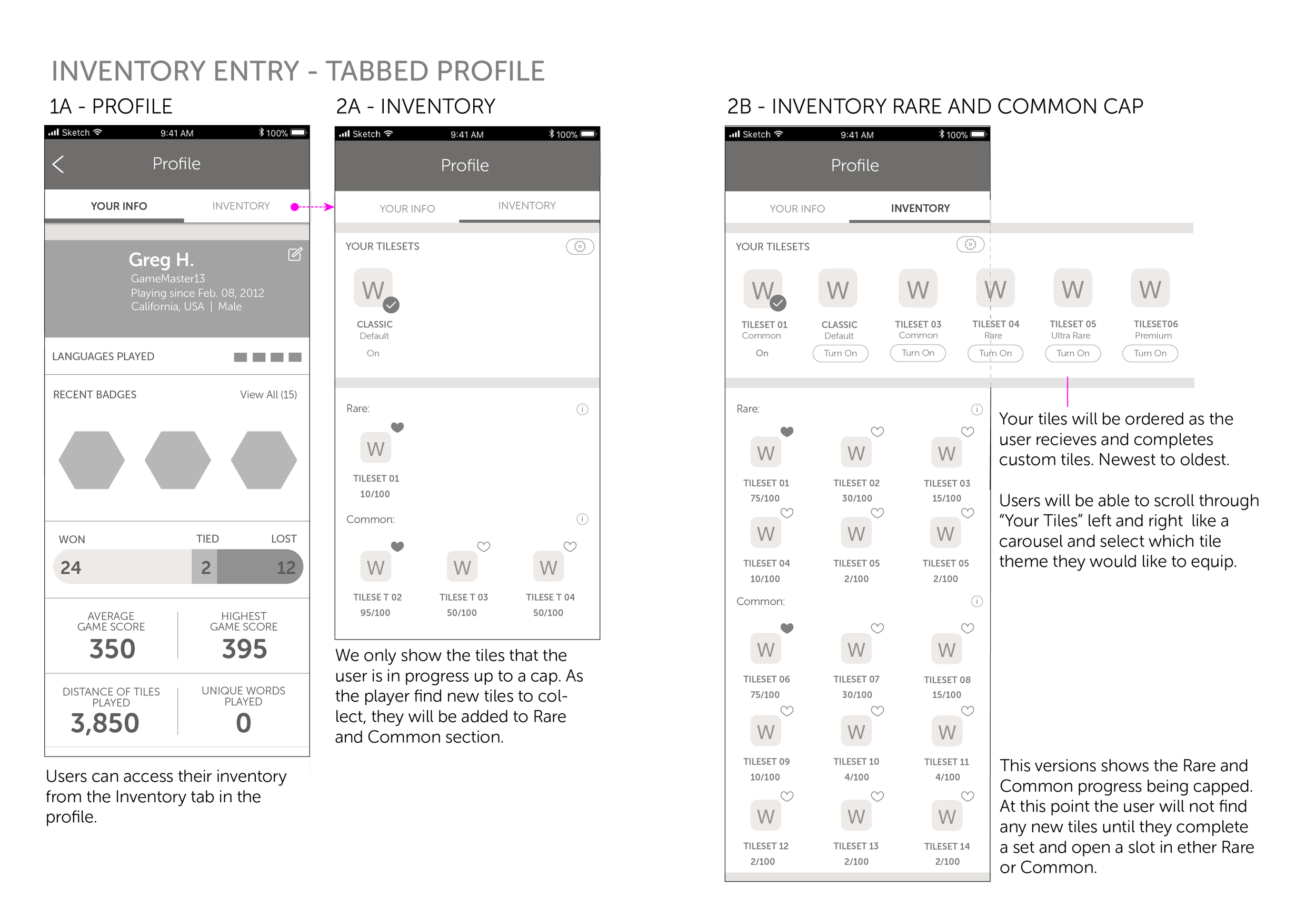
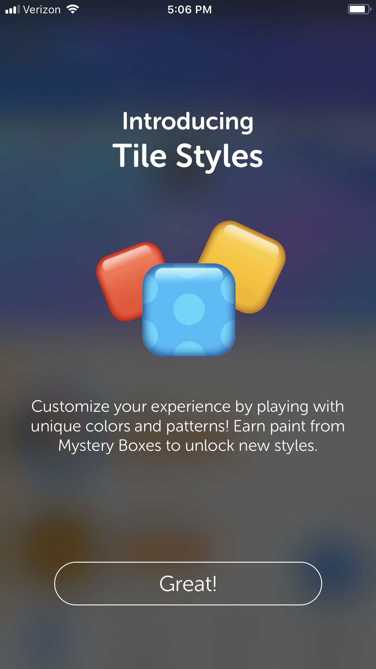
Tile Styles
Our post-launch plan for Words With Friends 2 was just as ambitious as the launch itself. We had a long list of features in our backlog and a clear objective but as we began to put these features in front of users one question kept coming up; Why? Why do I care? Why would I do that? Some of our users have been playing the same game for 9+ years. They don’t want anything else. Or so they said, over and over again. Despite the direct feedback their behavior was starting to change. We saw in the data that their powerup consumption and engagement with the coin economy was increasing. We knew we could already influence behavior by rewarding users powerups, coins and even cosmetic rewards like badges. It became clear to us that for these new features to succeed we would need to introduce more ways to reward our users. This led us to pursue an old idea, but one of the boldest in Words With Friends history: Tile Styles. This may sound like hyperbole but I have been part of two redesigns of the product and we barely touched the styling of the tiles in both of those. The gameboard was sacred and we were about to make a big change. Here are the goals we were trying to accomplish by taking that risk.
Feature Goals
To increase engagement in systems that reward Tile Styles.
To appeal to a large portion of our audience.
Prove user interest in cosmetic rewards, items of expression , and representation of status.
The leads began brainstorming reward vectors of all types. Cosmetic items, gameplay enhancements and bonuses. Anything that we thought would resonate with our users. The list included gameboard themes, themed tiles, a few new powerups, Weekly Challenge bonus points, and many more. We decided to put some of these features in front of users and see what they thought. Tile Styles topped the list for both cosmetic and gameplay enhancements. We pursued the feature but since it was such a big change for users we needed to prove it was worth it. Below are some of the methods we used to test these rewards with our users and to get conviction in Tile Styles. From the start we asked for user feedback on Tile Styles and optimized based on that feedback throughout development.
A maxdiff survey that weighs potential features against each other.
In-game click tests. To gauge interest from active users.
3x Consumer Insights interviews with Prototypes.
2x General surveys on potential art and general user interest.
Soft launch to test and optimize.


Tile Styles tested well consistently. It also satisfied one of the main goals for our users. Which was to provide a variety of ways in which we could reward users. Scrabble purists don’t want to use powerups because they view them as cheating so maybe cosmetic rewards would be more appealing. Once the positive survey results started to roll in we began development on the feature and I led the creation of the feature criteria/design pillars and spec from the UX side.
Design Pillars / Feature Criteria
Aspirational
Users are driven to earn Tile Styles and “collect them all”.
Something for everyone
Tile Styles gives everyone a way to express themselves and something to work towards.
Marketable Forever
Players look forward to finding out which Tile Styles are in the next release and which are next for them.
Basic UX
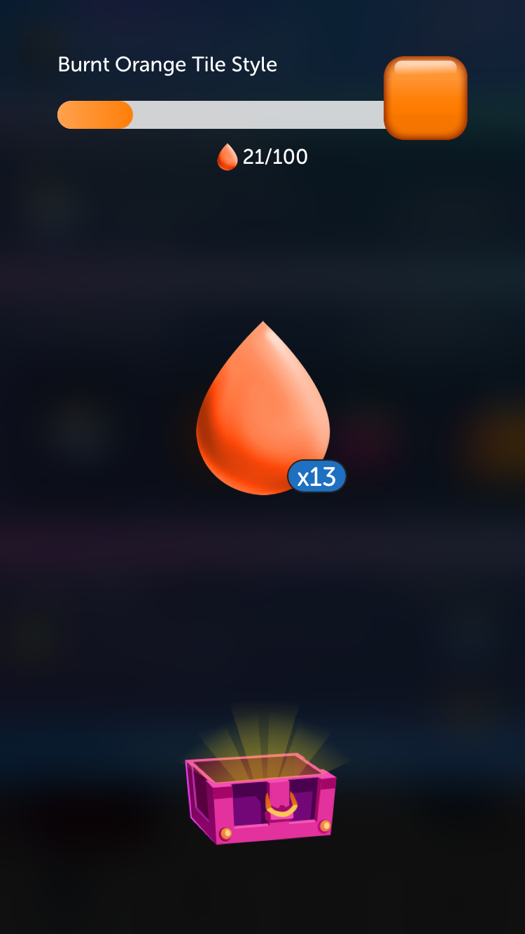
We needed a reward for multiple other systems so we wanted to spread the Tile Styles love out. We didn’t want to give out a whole Tile Style for a single action. It seemed as if a collection-like mechanic would best solve that problem. There were a lot of ways we could execute the solution and there were a lot of stakeholders. We had a lot of pressure from executives to create an alphabet collection where users would collect each letters to earn the ability to use the Tile Style. It sounded good in theory but the experience was confusing, and it limited our ability to reward users frequently, over a long period of time. In finding a overall narrative and visual language to translate progress we came up with many ideas that were ultimate rejected. We wanted to lean into an existing experience which is why we inevitably went with the progress bar used in the Weekly Challenge and Events features. After countless iterations and Consumer Insights interviews, where we presented Flinto prototypes, we decided on Paint as the unit of measurement that the players would collect. Paint worked the best because it reemphasized the fact that these Tiles were only cosmetic. Below is an example of the alphabet version but there were many other concepts and explorations, like pieces of the object (eg shards of ruby) and a standard building block material.
One exploration of the collection mechanic where users collected the letters in the alphabet.
How it works
Players earn Tile Styles Paint from Mystery Boxes earned by engaging with various Words With Friends features. When the player collects all the paint for a Tile Style, they unlock the ability to use it against their friends. Players each control their own Tile Styles and can see each other’s Styles in-game and on the gameslist.
Users earn paint by winning Mystery Boxes in other features
Once they collect x paint drops they can use the Tile Style on the gameboard.
Users can change their Tile Style from the gameboard or inventory screen.
Seasonal Premium Tiles are available for sale in the store.


Visual Design
The impact of this feature on the gameslist and the gameboard is huge. Suddenly our game is alive with color. It also had the added bonus of allowing players to tell which player played which tile. Below are some wireframes and a description of the general flows and functionality.

Results
Tile Styles set a new standard for adoption rates in Words With Friends. It double our expectations. For our launch event we paired with the Susan G. Koman Foundation to create a Breast Cancer Awareness Event that raised 100k. It was an all-around effort between the studio and partner teams (Marketing, Consumer Insights, etc) and it was a smashing success. Tile Styles was the most collaborative feature with Consumer Insights and Marketing that I’ve ever worked on and a lot of the success came from those relationships. We are now executing towards v2 and our ultimate vision for the feature. Below are some high level results.
Significant increase in engagement with surrounding features
Double our expected adoption rate
Increase in IAP revenue
My Role
Drove product strategy and vision for v1 and beyond.
Responsible for presenting and explaining strategy to executives and other stakeholders.
Design direction - At its peak 3 other designers were working on Tile Styles. I spent the majority of my time directing the overall strategy, design work and co-ordinating with 3rd party teams (marketing, art vendors, etc.)
Art direction and managing vendor pipeline to create Tile Style Art.

Words With Friends 2
Where we started
Words With Friends is an iconic game that has stood the test of time in a mobile application ecosystem that is harsh and competitive. It's important in that landscape to stay fresh and to keep reinventing yourself. Our competitors had been chipping away for years and we wanted to fight back while we still had the advantage. Here's what we knew going into the redesign:
New Words With Friends launch created growth in active users but those new users didn't stay.
User pain points went unsolved.
Increased competition in words games.
250M+ people had downloaded Words With Friends in the past.
The first two screens are from the original Words With Friends (2009), the second two are from the New Words With Friends (2014)
Our research method
Since Words With Friends was a live game, we were able to collect a ton of quantitative and qualitative data. We collected information utilizing the following:
User survey reaching ~2,000 users.
App Store reviews and tests.
Consumer insight interviews with rapidly created prototypes.
Extensive 8-week Longitudinal study.
In-game click tests and fake PAC ads exposed to a small audience.
Beta launches of features on one of our multiple platforms.
Metrics since Words With Friends first release in 2009.
Results of the research
As previously mentioned, Words With Friends had been downloaded by 250+ million people. Our research exposed some really interesting insights, the most important being that our users still have a very positive association with Words With Friends. As a result, we felt that by solving our main user pain-points (listed below), we could grow our Daily Active Users (DAU), increasing revenue.
Top 5 reason for leaving according to users
Boredom
Nothing to do while I wait
Nothing new / Same old thing
Game is difficult
Friends left so I lost interest
Based on previous user interviews and historic knowledge, we had assumed that the #1 reason for leaving was "My Friend left which caused me to leave as well." We also looked at our demographic data and found that our current audience (slightly more female, 35-45) was not the same at our peak DAU. Our largest age group was in fact 25-35 years. These results allowed us to think a little differently about the game and which features we tackled.
Ideation and co-design sessions
Results of a Co-Design Challenge (left) and a cross discipline team coming up with the Design criteria and challenge statements (right)
It was important to start with a collaborative process with a focus on Human Centered Design principles. I created Design Challenge statements and ran Co-Design sessions to generate ideas. From there we gathered more data and iterated tirelessly to optimize and get conviction. Below is a breakdown of the design process.
Multi-disciplinary design sessions and backlog review to generate ideas.
In–game and PAC heat tests for prospective features.
Rapid prototyping, consumer insights, and user testing.
Beta or "soft" launch features to a small audience.
Measure and optimize.
Holistic approach
A list of features and which pain-points they touch
We prioritized features based on which solved the most pain points, had the largest ROI, and performed the best during the various stages of the design process. Above is a visualization of the features and how they apply to the user pain-points and additional criteria. This feature also scored very high on a MaxDiff survey which tests user interest of in group of features measured against each other. It’s been one of the most accurate and insightful tools we have to gauge interest.
Lightning Round


One of the first features we developed is listed as Multiplayer (Team vs. Team) above, but evolved to Lightning Round as we iterated based on user feedback. It hit many of our users' pain-points, giving the user a new variation on the game that users could play at any time and was not reliant on friend availability.
Basic concept
Play anytime.
Up to 5 people on each team.
Race to a point total.
Fast-paced and competitive.
More FX, animations, and user delight.
Conviction process
We went through a rigorous conviction process for Lightning Round since it was a new concept that hadn't been done before. There was a lot of pressure to do a 4-player multiplayer mode, but through the design and conviction process, we decided on titling the feature Lightning Round. We are confident this was the correct decision because we prototyped multiplayer and it made some of our pain-points worse, as players had to wait for 3 people instead of just 1. Below are some details on the conviction process.
Surveys and Heat tests
Multiplayer scored very high on the MaxDiff test especiallyIn-game click tests
Users showed interest by clicking on fake adsUser Testing and focus group with prototype
Team vs. Team felt most unique according to focus groupBeta / Soft Launch
Significant increase in Game Creates
5 rematches if a user completes their first game
Our first Solo Challenge event "Literary League" where users could play against authors like Shakespeare
Solo Challenge
To fill in the remaining gaps in solving user pain-points, we decided to go with the next feature, Solo Challenge. This feature allows users to practice against increasingly difficult bots without the social pressure of playing with friends. It's particularly good for new users who want to learn.

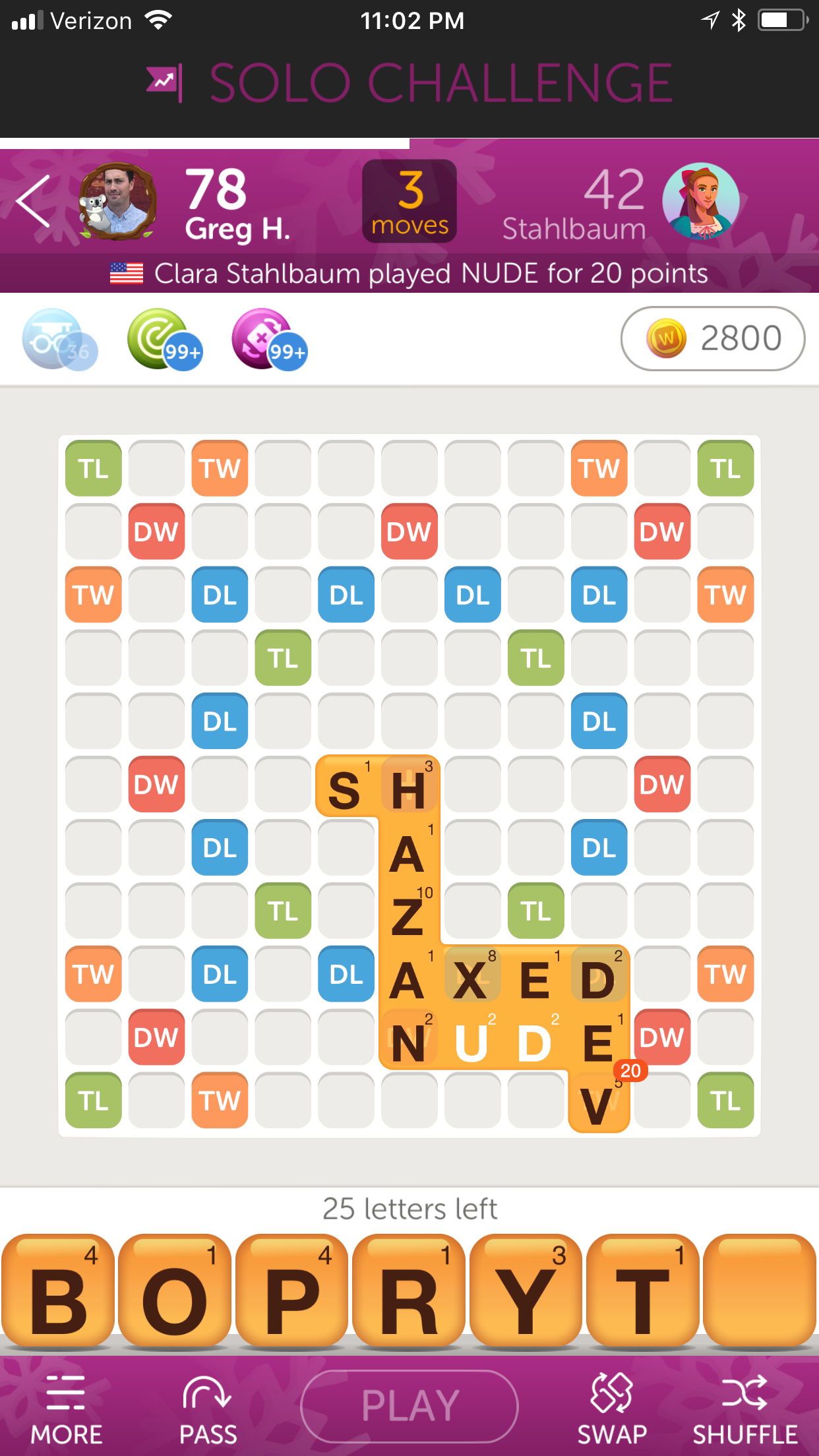

Basic concepts
Play increasingly difficult bots in a safe space.
Themed ‘events’ make the game different every time the user opens the app.
Play styles + bot messages educate users on strategy, game play, etc.
Limited moves adds a new twist to the game users love
Winter Tales artwork by Daisy Chan
Targeted UX optimizations
We scheduled some time for exploration into specific user experiences in Words With Friends 2. Based on feedback from users, we decided to focus on the games list (home screen), game board, and create game systems. We operated under the following principles:
Design pillars
Protect the Core.
Optimized and scalable systems.
Active game environment.
4 Concepts for the games list or homescreen
Games List explorations
We tried a variety of different UX concepts with users based on feedback from users. Some examples are pictured above. We played with the hierarchy of the profile pictures and the game info, experimented with UX of the "Your Move" games, and additional content. I've outlined the feedback below.
App Store reviews complaining that users' games were getting lost in the additional content of the games list.
User interviews stating “Your Move" games were most important.
Nothing new / no active content.
No system for surfacing new features or additional functionality.
In the end, we decided that users want to keep their "checklist" of "Your Move" games. We focused instead on creating systems like the Feature Carousel and the Heads Up Display (HUD). These features allowed us to call attention to new features, frequently changing content and user information.
A screenshot of the final gameslist
The game board
The game board is a very important part of the Words With Friends experience. Similar to the games list, users are very particular in what they want. Any changes we made need to be well thought out and must not get in the way of the core loop. Here's the problem-set we went after:
Users reported they were unaware of word strength and dictionary functionality in User Testing.
Important features are buried under the hamburger menu in the bottom left of the screen.
Players consistently ask to see the Swap, Pass, and the Tile Bag on the game board screen for convenient access.
Different UX for different devices makes it hard to teach users functionality.
Gameboard screen for iPhone X and iPhone 8 Plus. The content remains the same but the layout adjust to fill the extra space.
Along with some targeted UX improvements, we also changed the width of our screens from 320 to 375 points. We made this decision because the majority of our users were playing on an iPhone 8. It had the added benefit of making our spec sheets more accurate on android devices. The changes outlined below helped increase classic mode moves significantly. Keep in mind, since we make a lot of money through ad impressions increasing this metric (moves/DAU) increases our revenue dramatically.
Improved FTUE and messaging system.
Responsive UX fills available space and unifies layouts across devices.
Long tap words on the board to bring up Dictionary.
Pass and swap visible at all times increases moves by reducing clicks.
Create Game Design Challenges


We changed a lot in regards to our Create Game system for Words With Friends 2. Users were stuck in their habits and weren't creating games with new people; we wanted to change that. Below is some data that we found in our research.
7% of "new creates" were from the friends list.
Rematches account for ~70% of game creates.
Most people have 2.5 active games.
23% of new users said they couldn’t find friends.
Usernames were hard to search / find.
Words With Friends 2 Create Game System
Words With Friends Social Screen for a new user (left) with some modules that can be added for users with more friends on the right.
For Words With Friends 2, we completely revised the Create Game system. We wanted to support our 3 main use cases which are listed below.
Users connected via Facebook, who have a large amount of contacts to play.
Users connected via email, who have smaller group of contacts to play.
New users connected via email, who have no contacts to play.
The changes we made increased game creates with Friends significantly. We focused on surfacing users and modes that the users wanted. We also changed the algorithm for surfacing possible opponents to focus more on people that you knew, or people that the user had played in the past, but didn't have an active game with.
Social Tab on the main navigation brings the people you want to see up a level and replaces the create game screen.
Modular design of Social Tab scales to 3 most important use cases.
F.A.B. includes short cuts to game modes/people user cares about most.
Visual Redesign
Final Words With Friends 2 Gameslist (left) and original beta version (right)
Along with the added features and various UX improvements, we wanted to update the branding and visual design. We were designing, testing, and optimizing for the entire time we were developing the product. Below is a breakdown of the process.
“New Look & Feel” always preformed very well in heat tests so we knew it was important.
Multiple user surveys.
3+ rounds of User testing on look and feel alone.
Consumer Insights.
Soft launch for approximately 1 year.
Frequent iteration and optimization.
The first round of user testing


For the first round of visual explorations (examples above) we went big. We experimented with color, typography and layouts without many constraints. We were looking to define the essence of the Words With Friends brand. We wanted to answer the following questions:
Can we evolve the color palette past blue and yellow?
Do we need the tiles on the gameslist?
Can we change the font from Museo Sans Rounded?
Do we need the striped background?
Round two of user testing


In the first round of user testing our player's let us know that they wanted certain elements to remain constant. Players identified blue and yellow with Words With Friends but were open to introducing more color. They also felt strongly that the tiles shouldn't be changed and the font should stay Museo Sans Rounded. We also received the results of a user survey which among many other things asked users to associate celebrities with Words With Friends. Smart, witty people such as Robert Downey Jr, Ellen Degeneres, Alec Baldwin and Neil Degrasse Tyson were the leading picks. This was helpful for us to set the tone for visuals, copy, etc. going forward. We took the results of this round of testing into consideration for our beta launch and users were happy enough to rate our app 4.5 stars consistently.
Final Product


After being live for approximately 8 months we began receiving feedback internally that the product already felt dated and was too close to New Words With Friends. It didn't pass the "carbon dating test" as our CEO called it. The executive staff wanted us to go bigger since this product was meant to signal Zynga's turnaround. We decided to do another round of visual design and user testing which led us to the final design picture above. I'm very glad we did because I think the final design is much more clean, modern and sophisticated. Our user's loved it too and we held on to our 4.5 app rating through world wide launch.
Results


The Words With Friends 2 launch was incredibly successful and put the franchise back into the cultural zeitgeist. There was a ton of media coverage and we ran TV spots for the first time ever at Zynga. It also increased our key metrics and resulted in Zynga's stock price going up to where it hadn't been in years. Below are some key achievements and metrics.
Revenue Growth - Total moves / DAU increased
Audience Growth - Franchise DAU increased
Hit #1 Free App on iOS
#1 Top Free Game on Android